


 Copy Link
 Share on X
 Share on Facebook
 Share on LinkedIn


Always Active
Required for core functionality such as security, network management, and accessibility. These cannot be disabled.
Build intelligent AI systems that automate decisions, accelerate innovation, and scale business growth.
Design, build, modernize, and scale digital products that drive business growth.
Build secure, scalable, and intelligent platforms that power modern enterprises.
Build intelligent, connected, and autonomous systems that operate in the real world.
Flexible engineering capacity with predictable delivery, ownership, and outcomes.
Uncover the transformative potential of digital and mobile solutions for your industry

 Last Updated: May 11, 2026
Mar 22, 2024
Last Updated: May 11, 2026
Mar 22, 2024  3875
3875  23 min. Read


Key Takeaways
Struggling with user engagement? User experience is the answer. Learn to improve UX on your app with concise strategies covering design, accessibility, and performance—essential for a robust and user-centric platform that excels in satisfying users.

User Experience (UX) encompasses the entire process that defines user experience by crafting products to provide significant and pertinent experiences for users. This includes recognizing the requirements and constraints of users while synchronizing these findings with business aims and aspirations, covering instantaneous, episodic, as well as extended interactions.
In contrast to graphic designers who may concentrate on visual aspects, UX designers prioritize scrutinizing the dynamics between users and products. They dedicate their efforts toward forging an emotional bond with the user population to guarantee smooth and delightful engagements.
The multidisciplinary domain of Human System Interaction, also known as Human-Computer Interaction (HCI), plays a crucial role in elevating the user experience. It focuses on crafting and appraising computer systems to foster interactions that are not only intuitive but also gratifying for users. Originating from initiatives begun in the early 1980s aimed at making computers more accessible and less intimidating to use, HCI extends its purview to encompass ethical issues such as safeguarding data privacy and assessing societal impacts. This field is dynamic, continuously adapting to integrate novel technologies and forms of interaction, including those within human system interaction.
This discipline relies fundamentally on four main components: firstly, the user – central to HCI. Secondly, task-oriented activities carried out by said user. Thirdly, interfaces which serve as conduits for these interactions. Fourthly, and importantly, the operating system that provides vital support underpinning these elements within their respective contexts.

The cornerstones of User Experience (UX) are usability and accessibility, aiming to create products that are easy for users to engage with and thus promoting an inclusive experience. These two concepts share common ground and should be considered essential right from the beginning stages of designing and developing a product. They collectively cater to a wide range of user requirements, encompassing:
By addressing these variations in user needs, they ensure every individual has unhindered access.
Emotional design in user experience aims to touch upon the visceral, behavioral, and reflective aspects of our cognition to stir emotions that foster enjoyable experiences for users. The critical components integral to emotional design encompass:

Incorporating these elements into your emotional design strategy can cultivate user loyalty, distinguish your product from others, and amplify usability as well as contentment.
Delving deep into understanding what resonates with users and fabricating bespoke experiences through emotional design is crucial for forging an emotive bond. This not only boosts how they perceive the brand, but also strengthens both its collateral and identity.

By shaping a positive user experience infused with emotion-driven design practices, you reinforce:

The guiding principles of UX Design are instrumental in outlining key aspects such as consistency, predictability, feedback, communication, flexibility and efficiency. These tenets are dedicated to crafting an enhanced user experience. By maintaining a uniform design across similar elements that look and operate alike, these principles enhance usability and the ease of learning while fostering a feeling of trustworthiness and stability, all contributing to superior user experiences.
These fundamental principles act as navigational tools steering the course for creating engaging and pleasurable user experiences.
Maintaining a uniform design across website pages by using consistent brand assets, for instance:
is key to building user trust and familiarity. This consistency aids in making the users feel more at ease and less confused, thus positively influencing their overall experience on the site.
By ensuring that design elements operate consistently in various scenarios, predictability is heightened. This contributes to better usability and facilitates learning as users engage with different parts of the brand’s website.
Effective communication and unambiguous feedback play a pivotal role in navigating users during their engagement with interactions, encouraging active participation and quick responses. It’s imperative that this feedback is given immediately following a user’s activity to eliminate any potential confusion or irritation. The information provided must be easily comprehensible, interpretable, and lead to clear next steps to steer clear of uncertainty or mistakes.
These loops of feedback escort users through the website experience by fostering a rhythm of action followed by response, contemplation, and subsequent refinement. Calls to action on the website should be crafted with precision – utilizing language that prompts direct actions while being offered at opportune moments – all designed for guiding users smoothly towards taking desired steps forward.
By optimizing the design for both new and seasoned users, user centered design ensures that interactions are efficient and tasks can be automated. This approach leads to systems that are easy for beginners to learn while also providing quicker options in user interfaces for more experienced users, enhancing their productivity.
Inclusion of accelerators such as keyboard shortcuts and macros allows savvy users to expedite their workflow by cutting down on repetitive actions, thus boosting their performance on the platform. Personalization within UI designs enables a tailored experience. It adjusts automatically based on unique user profiles to facilitate an interface that aligns with each individual’s preferences and requirements.
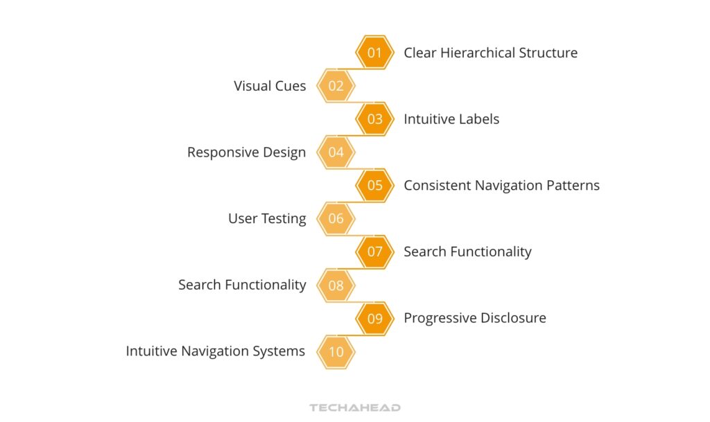
Clear hierarchy, intuitive navigation systems, and efficient search functions are vital in serving as the roadmap that directs users through an app or website. They center on providing a well-structured information architecture to aid user orientation.
Flutter widgets play a crucial role in managing complexity within an application by organizing the various logical sections of the user interface (UI). This modular approach simplifies maintenance and enhances manageability for each segment of the UI. The “Extract Widget” feature available under the Refactor menu in Visual Studio Code is instrumental in decomposing complex UIs into smaller, more manageable pieces that enhance navigability.
A website’s design should include a straightforward hierarchy and structure that ensures users can navigate through the site with ease, allowing for quick access to its content. The architecture of a site is constituted by how it organizes its pages into an easily understandable and predictable format which aids in intuitive user navigation. Common types of structures you’ll encounter on websites are:
The complexity of the website along with the amount of information it holds primarily influences which kind of structural arrangement is selected.
The integration of headings rich in keywords that are crafted skillfully not only augments searchability but also enhances user experience by leading visitors smoothly across different sections within your website’s content.
Seamless user navigation on a website is achieved through the implementation of various menu types and design elements that act as a virtual guide, ensuring users do not lose their way. This is essential for maintaining an uninterrupted and gratifying experience while browsing. The array of navigation menus includes:
Each type caters to specific organizational needs and structures unique to different websites.
Ensuring clarity and brevity in menus, coupled with readily recognizable hyperlinks, plays a pivotal role in fostering intuitive movement across web pages.
Having a robust search capability is crucial for rapid information acquisition, which aligns with the anticipations of users when they perform online searches. This feature enables users to quickly locate required information, fulfilling their expectations during internet inquiries. To ensure an exceptional searching experience, certain aspects should be considered including:
Given that mobile app users often give preference to using search functions over navigating through complex menus due to small screen sizes, it highlights the importance of enhancing search functionalities specifically for mobile usability in apps.

In web design, a mobile-first approach focuses on creating features and content initially for mobile devices, later modifying them to suit desktop platforms. This strategy guarantees that users have a smooth experience as they switch between different devices.
Responsive design emphasizes the importance of key elements such as optimizing loading speeds, incorporating interactive components, and implementing feedback systems to preserve user-friendly navigation and ensure an enjoyable experience for the user on any device.
A mobile-first approach emphasizes the creation of designs for smaller devices initially, before enhancing them to suit bigger screens. This strategy is fundamental due to the surge in mobile internet consumption surpassing that on desktops. Search engines such as Google are known to demote websites in their rankings if they fail to provide a user-friendly experience on mobile platforms.
When adopting a mobile-first design, there can be an added advantage of streamlining code and minimizing coding errors. It also promotes the presentation of content that is both succinct and effective when viewed on smaller displays.
Using relative units and CSS methodologies, fluid grids and flexible media are designed to adjust deftly across diverse screen sizes and orientations. Fluid grids employ relative units such as percentages instead of fixed ones like pixels for defining the sizes and positions of elements. This approach allows the design to be responsive to different display dimensions while preserving both usability and visual appeal.
Within these adaptable layouts, flexible media employs CSS strategies to ensure smooth scaling within fluid grids so that elements such as images or videos retain their intended aspect ratio irrespective of the available viewing space.
The compatibility of touchscreens aims to improve their responsiveness and usability, thereby refining the experience for the user. The performance and utility of touchscreens hinge significantly on how responsive they are, which influences both how swiftly and precisely they react to touch inputs. When touchscreens demonstrate increased responsiveness, it translates into a need for less pressure for command recognition, making them easier to use while reducing chances of erroneous inputs.
Capacitive screens have gained prominence due to their outstanding response levels. These types employ an electrostatic field in identifying touches instead of depending on mechanical components.

Improving the overall user experience on a website entails actions such as optimizing images and media, reducing HTTP requests, and leveraging browser caching to accelerate page loading speeds.
Crucial for an optimal user experience is the enhancement of page speed since slow load times often result in increased bounce rates and can frustrate users. Employing responsive design is vital to ensure that interactive elements and feedback systems are preserved, aiding in the overall acceleration of the site’s performance while fostering a positive experience for users.
Optimizing images and media entails compressing the file size while maintaining visual fidelity, thereby enhancing website speed and elevating search engine placement. The procedure of image optimization is centered on diminishing file sizes yet preserving high quality to secure reduced loading times for webpages. This process also incorporates optimizing images for search engines to improve visibility. Images that are not optimized can constitute as much as 75% of a webpage’s total size, which can significantly decelerate load speeds and negatively impact the performance of the site.
Employing methods like ‘blur up’ techniques along with progressive JPEGs can create an illusion of more rapid page loading by initially presenting an image in lower quality.
Streamlining the loading times of a website can be achieved by minimizing HTTP requests, as each element like an image, stylesheet or script initiates a new request. To enhance the speed at which websites load, it is crucial to reduce these requests. By merging various CSS or JavaScript files into one and stripping out superfluous characters through minification, we effectively lessen HTTP requests and boost loading efficiency.
The use of CSS in place of images for visual effects, amalgamating multiple images with CSS sprites, and embedding small images directly within HTML using data URIs are all techniques that substantially cut down on the number of image-based HTTP requests. This contributes notably to quicker page display times.
The process of leveraging browser caching includes the following actions:
When a user first accesses a webpage, their browser stores resource files locally, which reduces load times for subsequent visits.
To implement browser caching, one can adjust server settings using tools like mod_expires for Apache servers or the expires directive for Nginx. For content management systems (CMS) such as WordPress, plugins including W3 Total Cache or WP Super Cache are available options.
It is essential to regularly test and oversee your website’s caching practices in order to ensure that performance remains at its peak. By doing so, you’ll also be able to fine-tune cache lifetimes according to how often your site content gets updated.

Observing genuine users as they engage with a website, pinpointing challenges they may face, and collecting their input is the essence of user testing and feedback collection. This process enables designers to see firsthand any hindrances that disrupt the seamless experience of users on their websites. Direct engagement with users during testing yields constructive critiques essential for making precise enhancements.
Following interactions with a website, surveys serve as an instrument for acquiring insights and reactions from users regarding their encounter with the site.
Usability testing focuses on assessing the operational facets of a website by tracking user interactions during designated tasks. At the heart of superior user experience design lies usability tests, which prioritize decisions based on what users require. The goal is to monitor how users interact with a product prototype, ensuring it meets their expectations and influences subsequent design decisions.
There are two approaches to conducting usability tests: moderated and unmoderated. In moderated tests, participants are guided through specific tasks while in unmoderated tests they navigate tasks independently. It’s essential to examine the data garnered from these usability studies thoroughly as this helps pinpoint trends and trouble spots that facilitate ongoing enhancements in design.
Tools such as surveys and interviews are instrumental in accruing data on user research, shedding light on the behaviors, attitudes, preferences, habits, goals, and frustrations of users. As a cost-efficient approach to collecting this data from user research activities, surveys can be scaled effectively to encompass a wide range of audiences promptly. When carefully crafted with good design principles in mind, they offer high levels of representativeness, which is key for accurately capturing comprehensive insights into users’ behaviors, attitudes preferences, habits goals and frustrations.
These participants when engaging in surveys tend towards being less affected by the Hawthorne Effect—a phenomenon where individuals modify an aspect of their behavior due to being studied thus responses gathered through these means often exhibit greater authenticity free from undue influences associated with observation. This helps preserve true reflections perceptions harbored within respective persons involved.
Tracking and visualizing user behavior through analytics and heatmaps are essential for understanding engagement with different elements on a website. These tools serve as vital components of the UX toolkit, enabling insight into user interactions across various sections of a website.
Both quantitative data from analytics—offering solid metrics—and qualitative insights from heatmaps—which explain why users act in certain ways—are provided by these tools. When UX teams combine heatmaps with additional qualitative research instruments such as session recordings and on-page surveys, they can achieve an enhanced comprehension of user behaviors and preferences.

Ensuring that products are easily navigable and meet the needs of a wide audience is critical to user experience. Inclusive design and accessibility play key roles in this endeavor. The semanticsLabel property by UsefulText within Flutter allows for maintaining visual clarity of text, while simultaneously enhancing its accessibility. This is achieved by providing detailed semantic descriptions for screen readers, aiding users who have visual impairments.
To facilitate the correct interpretation of word pairs as distinct entities by screen readers in applications built with Flutter, it’s important that developers avoid joining strings without spaces. Adhering to flutter app development best practices involves coding with separated words rather than concatenated strings within your flutter code base. Before adjusting any code, installing Flutter on your system is an essential first step for any developer looking to work on such an app.
The Web Content Accessibility Guidelines (WCAG) are the global benchmark for web accessibility, offering comprehensive technical guidance to ensure digital content is accessible to those with a range of disabilities. With WCAG 2.2 unveiled in October 2023 after previous iterations, versions 1.0, 2.0 and 2.1, these guidelines encapsulate the ongoing push towards international standardization of web access inclusivity measures. The criteria within WCAG assist owners in creating websites that meet the accessibility standards mandated by anti-discrimination laws such as the ADA and Section 508, thus addressing various user needs effectively.
Ensuring that user interface components are accessible is imperative for making websites usable to the most diverse group of users, which includes individuals with a range of disabilities. It’s essential for these components to be designed so they can accommodate users with visual impairments, hearing difficulties, motor skills challenges, and cognitive limitations.
For users who have visual impairments, it’s important that UI elements feature high contrast ratios between text and backgrounds. Information should not rely solely on color differentiation, but must also remain clear through other indicators. Text resizing capabilities should be provided to meet individual needs for legibility. Meanwhile, those with mobility issues need user interfaces that can respond to keyboard-only navigation without requiring specific timing or dexterity—this ensures seamless interaction even when using assistive devices like voice recognition software or hardware switches.
Enabling individuals with disabilities to engage fully with digital content is possible by making sure they can.
It is essential to ensure that assistive technologies are compatible when creating user experiences that are inclusive, as this allows people with disabilities the opportunity to access and navigate online platforms effectively.
Visual impairments become less restrictive thanks to software like screen readers, which read aloud written content, or magnification tools that increase the size of what’s displayed. Large-font keyboards offer visual guidance while tactile ones provide physical feedback during typing and site exploration. For those facing physical or cognitive challenges, alternative methods such as head pointers, eye tracking systems or motion detection devices make website use feasible without traditional input hardware. Speech recognition programs also offer hands-free navigation options.

Artificial Intelligence (AI) coupled with chatbots significantly augments user engagement, providing customized assistance on websites. AI-driven chatbots leverage Natural Language Processing (NLP) to deliver automated but tailored responses that grasp subtle details, thereby nurturing brand loyalty.
These AI-powered assistants are capable of:
The benefits provided by AI and chatbots include around-the-clock accessibility, enhanced cost-effectiveness, the ability to actively engage with customers, scalability of service, and potential for boosting sales figures.
AI-powered chatbots are always accessible for users across different time zones, which enhances customer satisfaction and strengthens the trust in a brand. They also contribute to cost savings by automating routine tasks that traditionally require human labor—this not only reduces expenses but allows live agents to focus on more complex issues. These intelligent systems proactively interact with customers anticipating their requirements and initiating conversations that can cultivate loyalty towards a brand.
Chatbots excel at handling numerous interactions at once, significantly improving an organization’s capacity to scale its customer support operations without leaving any user unattended. These smart assistants can amplify revenue streams through their capability of offering additional purchasing options via upselling or cross-selling approaches during natural dialogues with users.
The incorporation of AI and chatbots can markedly improve the user experience by offering bespoke assistance on websites. The integration of these technologies has been shown to elevate interactions with users and deliver tailored support.
To select a suitable chatbot solution, one should consider exploring free trials and product demonstrations. This process helps confirm that the chosen system aligns well with the particular needs of a business and effectively tackles recognized issues.

Designing chatbot interactions optimally involves crafting exchanges that mimic human conversation, thereby elevating the level of engagement these interactive systems offer. Through conversational AI advancements, we can equip chatbots with more natural interaction capabilities and through continual training improve their awareness of context. Enhancing user experiences is achievable by incorporating features such as:
Such elements are key to bolstering the interactivity provided by chatbots.
Personifying the chat experience without anthropomorphizing it helps maintain a brand-consistent tone while managing user expectations effectively. Meaning it’s important not to visualize bots with human likenesses yet ensuring they convey an image reflective of the brand in a way that resonates positively and keeps users engaged.
Ongoing assessment and refinement are crucial components of continuous improvement in website design, ensuring the optimization of the user experience. Through regular evaluation and improvement efforts, a strategy for progressive enhancement can be established by pinpointing areas that require improvements with routine UX audits.
Utilizing A/B testing along with multivariate testing is instrumental in making informed decisions about website design, thereby augmenting user experience through empirical comparison between varied webpage iterations. By acknowledging and integrating feedback from users, the evolution of the website aligns closely with their needs and anticipations, promoting an increasingly satisfactory journey as time progresses.
Consistently conducting UX audits is crucial for maintaining a website’s alignment with the needs of its users while fulfilling intended goals. Such audits act as a diagnostic tool, pinpointing aspects of the site that require improvement to elevate the overall user experience and better achieve target objectives.
By engaging in frequent UX assessments, businesses can gauge and advance their user experience maturity levels, which directly contributes to improved conversion rates on their websites.
A/B testing, or split testing, and multivariate testing are powerful tools that support making data-driven design improvements to enhance the user experience by evaluating distinct versions of a webpage. The essence of A/B testing is contrasting two variations of a webpage or app to identify which version yields superior performance. Such tests can be conducted on multiple elements including:
To ensure that conclusions drawn from A/B tests are valid, it’s important these tests are carried out over a period sufficient enough to collect statistically significant data. Following this principle ensures only the best-performing variant is adopted.
Understanding and meeting the needs and expectations of users is crucial for improving the usability and value of a website. This requires identifying and resolving the issues that visitors encounter, ultimately elevating their experience on the site.
Maintaining contemporary design elements and content helps avoid making a website feel dated, preserving its relevance without necessitating an entire overhaul. Rapidly fixing 404 errors and refining user navigation pathways can minimize interruptions in user engagement, thereby enhancing the overall experience someone has when using your website.
Embarking on the endeavor to enrich user experiences within apps, we’ve explored a multitude of aspects starting with the expansive field of UX and its critical components. We’ve examined how essential human-computer interaction and usability are, as well as embraced the fundamental tenets of UX design. Our exploration has included strategies for seamless navigation and structuring information architecture effectively, alongside underscoring the necessity for mobile prioritization and adaptable designs. In our venture, we enhanced website functionality, conducting user tests, gathering feedback, championing inclusive design practices, accessibility standards, and incorporating AI-powered chatbots. It’s evident that tailoring improvements according to user preferences is key—it’s an evolutionary process in lieu of being a final goal. This guide aims to act like your navigational tool, inspiring you towards crafting impactful experiences that resonate well with users on both websites and apps.
UI design is centered on the development of visually appealing interfaces, whereas UX design concentrates on crafting an engaging and fluid experience for the user.
When it comes to UX design, it emphasizes comprehending what users require and undertaking investigative efforts in order to create interfaces that are instinctive and easy for users to navigate.
When developing your product, it’s crucial to grasp the five elements of user experience, which include strategy, scope, structure, skeleton, and surface.
The term “User Experience,” often abbreviated as UX, refers to the comprehensive process users go through during their engagement with a product. This includes every aspect of their interactions and the complete path they follow in order to accomplish tasks.
Flutter is a free and open-source software development kit designed to streamline the creation of high-quality, natively compiled applications for both iOS and Android platforms using just one codebase. This approach simplifies cross-platform app production while ensuring efficiency.
The platform is not limited to mobile. It enables developers to build attractive apps for web and desktop as well, all from the same single codebase, maintaining Flutter’s promise of versatility in application development.
The field of Human-Computer Interaction (HCI) plays a critical role in UX design, as it emphasizes the development of interactions between individuals and computer systems that are not only user-friendly and intuitive but also enjoyable.
Ensuring these elements is vital for fostering a positive experience for users.

We use cookies to ensure our website functions properly, improve performance, and provide a personalized experience. You can choose which types of cookies to allow below.
Required for core functionality such as security, network management, and accessibility. These cannot be disabled.
Help us understand site traffic and user interactions so we can improve performance and usability.
Enable enhanced functionality and personalization such as language or region preferences.
Used to deliver relevant ads, track campaign performance, and measure advertising effectiveness.