
Staff Augmentation
Access top-tier talent on demand: Dedicated, Hourly, or Flexible.


 Copy Link
 Share on X
 Share on Facebook
 Share on LinkedIn
The Passion for Designing Makes You a Pro
Technical Evolution as a UX Designer – Interview with Anke Mehlert
Anke Mehlert, a UI/UX designer with over 10 years of work experience based in Germany currently works for Volkswagen Financial Services. As part of our interview series, we reached out to Anke about her past and future work experiences. One of the things Anke helped creating might be familiar to you. She worked on the icons of the Nokia 5800 XpressMusic Smartphone, one of the leading devices at that time.
Introduction on your website explains that you are a pro at Android and iOS app design. How do you justify that statement?
Anke: “Designing a mobile application means not only to understand users and their needs but to anticipate the worst-case scenarios. The happy path is easy to find and designed, but there are several other user scenarios and circumstances under which the user is still trying to use your app. I’ve done work on either platform, but to know your way around and beyond them is the key to be a professional app designer. It’s not enough to know the ‘happy-path’ and the ‘happy-path-user’ and the current ‘state-of-the-art’ devices.
There is a danger in getting caught in either camp when it comes to app design. Apple has great HCI guidelines, and Google’s material design seems to be a simple way to get a perfect solution. In reality, these guidelines just get you to a certain place and often they expect a perfect scenario.
You need to explore the outskirts of these scenarios to gain a greater understanding of the people and the technology you are designing for.
A user doesn’t always have the newest iPhone or Android device and isn’t connected with a stable and fast WiFi connection. You need to take into consideration that there are hundreds of screen resolutions out there, slower operating systems, older devices with a short battery life and services provider contracts with a low mobile data allowance. Even WiFi isn’t as reliable as we pretend it to be. Many WiFi connections are flaky and suffer from timeouts.
It is much more important to understand that success lies in how an app behaves when things go wrong. If you don’t prepare for the worst and have a plan, your user’s plan will be to not use your product and go elsewhere.
The time of building bespoke for certain platforms is over. With new form factors coming out all the time it is most important to build resilient experiences.”
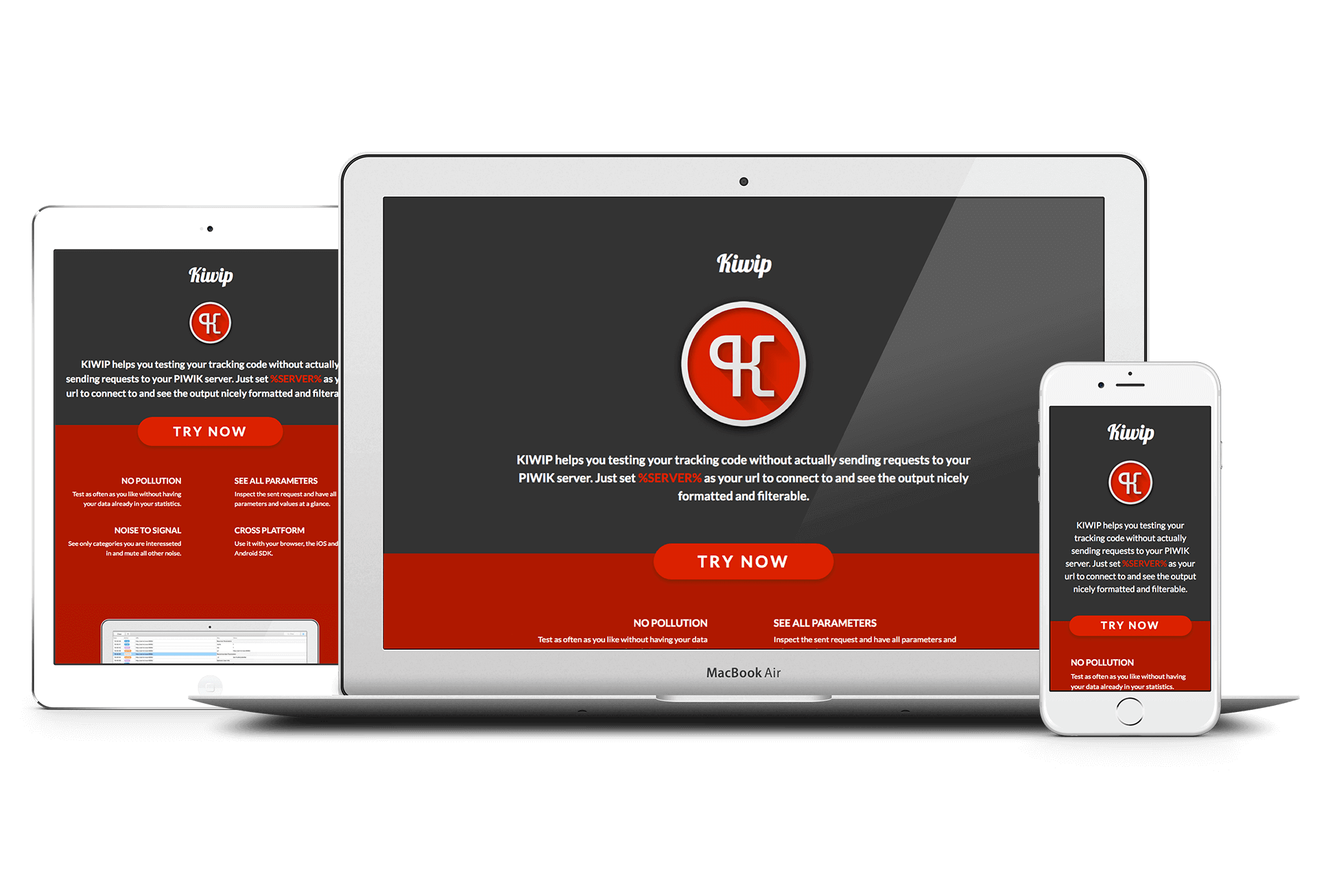
Kiwip Web and Mobile App Design by Anke Mehlert
How is your work experience at Volkswagen?
Anke: “I work for Volkswagen Financial Services, the financing division of the entire Volkswagen Group. More specific it is the new Digital Unit, that has newly been founded at the end of 2016. The DU’s job is to digitalize application processes for all financing products and services that have been sold through the dealership until now, in order to foster new technology and development approaches around for the digital world.
Our current products and services are web-based but mobile-first, and we are also working on several innovative ideas for mobile applications around cars and financing products, such as fuel cards.
The work experience is amazing. I came to a company that has been working on financial services for almost 70 years and is based on the founding of Volkswagen back in 1937. This means we are looking back at about 80 years of user experience, insights, evolvement, innovation and historical growth around cars and finance.
To join a new unit, that is assigned to transfer and translate this knowledge into the new age and being able to bring in my knowledge, is an enriching experience.
When I entered the unit in January 2017, I met a very young and open-minded team that was able to transfer a purely analogue user journey of car finance into a first truly digital MVP within six months.
As one of the first newly hired UX/UI designers at VWFS it was surely challenging, but to be able to build up a new department, being able to design not only prototypes but the environment you’re working in, is the biggest reward. It’s like planting a seed and seeing it grow.
To understand the significance of this approach, it’s enough to say; we changed the workflow from waterfall to agile and the official language from German to English. The Digital Unit is an international team with people coming from all over the world. Within six months we established a healthy environment of open and transparent communication, living community and togetherness. That is outstanding.
Just as an aside, that is important to me: When I applied for this job, I did not only apply for myself but also for Larry, my office dog. It’s due to this start-up-atmosphere we are living, the first time in VW and VWFS history, due to the exceptional circumstances, I was allowed to bring him to the office now and then.
What I don’t want to hide, besides this great experience, is the work you have to do. Being the first externally hired UX/UI expert for the Digital Unit means that you have to do a lot of work on the Meta-Level of the organization.
It didn’t only mean to bring in my conceptual or design skills, but to understand the role of a UX/UI expert in a Unit of 60 people, 9/10 being developers or managers, coming from a huge company history and background.
Right now I am not only a full-stack designer, going all the way from user research to the latest update of a clickable prototype, but a UX/UI evangelist. I’ve been involved in every step of this process during my career, and I profit from that wide skill set. But now I have to transfer this knowledge into the strategical planning of an assigned unit and the application of new designers, UX research experts, UI specialists, etc.
This boils down to the conclusion: I am in an exceptional situation at Volkswagen (Financial Services), which makes my work experience unique, challenging and inspiring. “
How important is the visual response by a mobile app?
Anke: “It is not only important – it is essential. Latest studies show that the stress level of users who don’t get a response in 2-4 seconds is the same as watching a horror movie. That’s not the response you’d like to trigger.
There’s, of course, a caveat that the stress level increases with urgency. You’re OK to wait a bit longer to show a cute picture to someone. But not knowing which track a train you need to catch in 2 minutes leaves from is another level. The same applies to your need to give information.
Say you had an accident and you need to contact your insurance company. This needs to happen much snappier than looking up a recipe for what to cook tonight. The biggest task is being responsive to input. A user not getting an immediate tap/click response and no feedback that the action has been recorded and is being worked on will keep clicking and be tapping over and over again. The user is stressed and reacts with pressure, surely if I click it a few times, something happens!
Impatience is a big thing with mobile users. We’ve been promised magic in our pockets and everything at our fingertips. Any delay in that is a broken promise. Our job as designers is to keep users busy, not wondering if something is happening or not. One great tool here is transitions and – if there are real delays – a reassuring and happy waiting animation.
The main trick here is to turn any passive waiting into an active action. Airports learned that quite some time ago. Instead of having a luggage belt near the aircraft where everyone will have to wait without anything to do, travelers are sent to the other side of the terminal with customs in between. That means that by the time they reach their luggage it will have arrived and the whole time in between is spent on something that felt more useful or necessary than staring at an empty luggage belt.
Our interfaces should try to do the same. Rather than just having a loading spinner, allow people to go on with the flow and enter the information needed at the next step. That way any delay becomes unnoticeable. Of course, this can be tough to achieve. My current project has the issue of a slow server response, which is why we need to resort to waiting animations. We will get there though.”
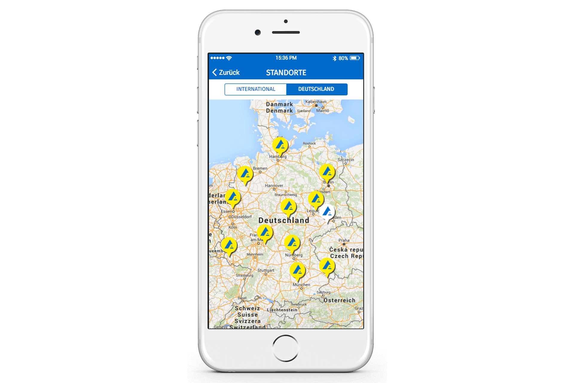
ALFIX Mobile App Design by Anke
Tell me about the most challenging project you have ever worked on? How did you approach the challenge?
Anke: “I find each project I am working on the most challenging one, as I do right now. I always look for new challenges and always find room for improvement, so every project is more challenging than the previous one.
What I found to be the even more challenging part of the job as a UX/UI designer is the environment of clients, stakeholders or sometimes even your own company.
When designers have the right tool-/skillset and great people to work with, the project can be as challenging as it wants to be – it will still most likely be simple to solve it. The bigger challenge as a UX/UI designer happens on a communication level with the people you work with or for. In schools and university, they teach you methods and technical skills, design principles and what user-centred Design means. But they don’t prepare a designer to sell his/her work to a client, a boss, a colleague. They don’t prepare students how challenging it can be to have multiple stakeholders and indirect communication and the importance of transparency in their work.
Having said that, since I now work at a huge company and have already over 50 people involved in my project, this is for sure the most challenging one so far. Digitalising a so far only analogue/offline contract for a finance application is tough. All the legal and compliance issues and the data users need to provide in order to be evaluated is already challenging enough. Making a very dry applicant user journey vivid and rewarding to use for a customer that only wants a car leaves a lot of room for improvement, even if you’re only aiming for bringing an MVP to life.
But being in a new unit solving all the communication challenges with stakeholders in different countries and different brands, on-site and off-site, is the most challenging part.
The only way I found to tackle this was by building up a communicational hierarchy. As we are working agile, the hierarchy is the most hated word, as it sounds like a waterfall. But what you are doing is defining an infrastructure that allows you to spread information with minimal effort. What you need to do to build this, is to get to know the right people in your team that will support and understand you, ask the right questions and then takes it from there. If you can rely on those people, you will finally be able to do the real work of a UX/UI designer and make a very complex application form simple and rewarding to use.”
Where do you look up for inspirational mobile design patterns?
Anke: “Everything can be an inspiration if you keep an open mind and constantly question what you see. Recognizing patterns is not only something computers are good at. It is also fun for us to do. Getting out of your comfort zone, looking how people are using existing systems and – most importantly – seeing where people get frustrated is a great way to find out what to do right in your own solutions. Of course, there are tried and true solutions to pick and mix from. Google’s Material Design Styleguide is a great resource to help you tackle the issue of having to support lots of different form factors. Microsoft’s Inclusive Design Guidelines are a refreshingly new look at the issue of disability and cognitive issues when it comes to interfaces.
Apart from that, I am a fan of Dribble, Pinterest, and Co. when I start a new project and try to get some inspiration.”
This is not the end. Anke has some more questions to answer, stay updated with TechAhead. In the meantime, you can view more such interviews with various UX designers:
Read also:
Interview with Vytautas Alech,
Interview with Eric Blattberg,


