


 Copy Link
 Share on X
 Share on Facebook
 Share on LinkedIn


Always Active
Required for core functionality such as security, network management, and accessibility. These cannot be disabled.
Build intelligent AI systems that automate decisions, accelerate innovation, and scale business growth.
Design, build, modernize, and scale digital products that drive business growth.
Build secure, scalable, and intelligent platforms that power modern enterprises.
Build intelligent, connected, and autonomous systems that operate in the real world.
Flexible engineering capacity with predictable delivery, ownership, and outcomes.
Uncover the transformative potential of digital and mobile solutions for your industry

 Last Updated: May 11, 2026
Jul 17, 2024
Last Updated: May 11, 2026
Jul 17, 2024  4768
4768  17 min. Read


Key Takeaways
Mobile user interface design is not just about making things work, it is also about how mobile apps interact with consumers.
As an Android app development company, mobile app interface design can be challenging, but it is no rocket science. Despite the smaller screens, there are many benefits to mobile app UI design.
A survey from Oberlo depicted that with 52.08% of web visits coming from mobile devices compared to 47.92% from desktops, people are using their phones for everything, from working out to shopping online and more.

For businesses looking to navigate the complexities of app development, mobile app consulting offers expert guidance and strategic insights. Our mobile app consulting services ensure that your project is aligned with industry best practices and market demands, driving successful outcomes.
In this blog, you will get to understand the mobile app design principles with the examples that you have seen in the market. Examples will give you the best knowledge about how they are the leaders in the market.
Top mobile app development company Mobile user interface design is all about creating the look and feel of a mobile application. This includes making sure the app is visually attractive and easy to use. It involves designing the user interface (UI) and user experience (UX) with attention to layout, colors, fonts, icons, and overall style.
Good UI/UX design is crucial for capturing user interest and engagement. Focusing on design early in the mobile app development process can save money and increase the app’s success and return on investment (ROI).
A key principle in mobile app design is to keep things native, meaning that the app should follow the specific design guidelines for Android and iOS. Each platform has its ways of handling navigation, content layout, buttons, and other elements. Education app development company professionals often specialize in creating intuitive UI/UX designs that enhance learning experiences and engagement.
Understanding these differences is important before starting the design process. Let’s look at what you need to consider before designing your mobile app.

There are fundamental principles for your mobile user interface design. Show your app’s value by giving users what they want right away.
Creating a well-designed mobile app can attract users and increase your return on investment (ROI). Here are ten key principles to follow for effective mobile app UI design.
“Keep it simple and clear”
A cluttered and confusing interface can frustrate users and make them abandon your app. To create a clean and intuitive UI.
“Guide User’s Attention”
Visual hierarchy is about directing users’ focus to the most important parts of your app. Use these techniques.

Size of Elements in a Mobile App
“Adapt to Different Screens”
Your app should look and work well on all devices and screen sizes. Achieve this by:

Different Screen Sizes
Users expect certain design patterns. Stick to familiar navigation methods.
Users’ past experiences shape how they expect apps to work. Use common design patterns but adapt them to fit your app’s context. Follow standard navigational principles to help users easily understand your app’s layout and features.
Since users might leave your app to do something else, save their progress so they can continue later without starting over.
Ensure users can reach any part of your app within three clicks. Keep navigation simple so users can easily find their way around. If there’s an error, provide a way to return to the homepage or suggest other pages.
If you have both a desktop site and a mobile app, ensure users’ activities and progress are saved across both. For example, someone might browse products on their phone but complete the purchase on a desktop.
“Build a Strong Identify”
Make sure your app’s design is clear and focused on important tasks.
Use descriptive and appealing names for products. Avoid confusing terms like “standard shipping” and “regular shipping.” Use techniques like Card Sorting to understand customers’ mental models.
Show the most important features in the primary menu and the less important ones in the secondary menu. Use font size, background contrast, and whitespace to draw attention to key features.
Users often scan text in an F-pattern or Z-pattern. Place important information and visuals where they are most likely to be seen.

The F-Pattern and Z-Pattern
Consistent branding helps users recognize and trust your app. Maintain brand consistency by

“Make Forms Easy to Use”
Forms and input fields are critical in many apps. Make them user-friendly by:
“Ensure Easy Navigation”

Use of Hand Placements
Good navigation is key to a smooth user experience. Enhance navigation by
“Design for Everyone”
Make your app accessible to all users, including those with disabilities
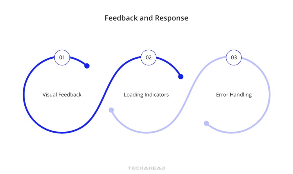
“Provide Timely Feedback”
Give users feedback on their actions to improve their experience.
“Smooth User Onboarding”
The onboarding process sets the tone for users’ experience with your app. Make it smooth by

“Continuously Improve”
Testing and refining your mobile user interface design is important for a great user experience.
Each and every principle you will follow will add a point to your mobile app development project. If you create a mobile app that is not only visually appealing but also user-friendly and effective in meeting users’ needs. You can learn more about the top strategies to enhance user experience on your mobile app.
Here are the top standout UI examples that demonstrate excellent design and innovative user interaction.

Spotify’s mobile user interface design is a big part of its success in the music streaming world. It combines great looks with easy functionality.
Spotify’s dark theme with vibrant playlist images is easy on the eyes, making it a standout in the music app world. They are one of the examples for mobile user interface design.

Discord’s Discover feature is a great example of modern, intuitive design. It helps users find and join communities that match their interests.
Discord’s mobile user interface design takes attention to detail, from typography to subtle animations. It makes their user experience smooth.

Netflix excels in personalized, presenting content that matches user preferences through a well-designed interface. They keep hustling with designs and ideas for the future.
Netflix’s personalized recommendations make it easy for users to find and enjoy new content. They have been an attraction because of their mobile user interface design. As they have been getting users day by day.
Read More: Netflix System Design
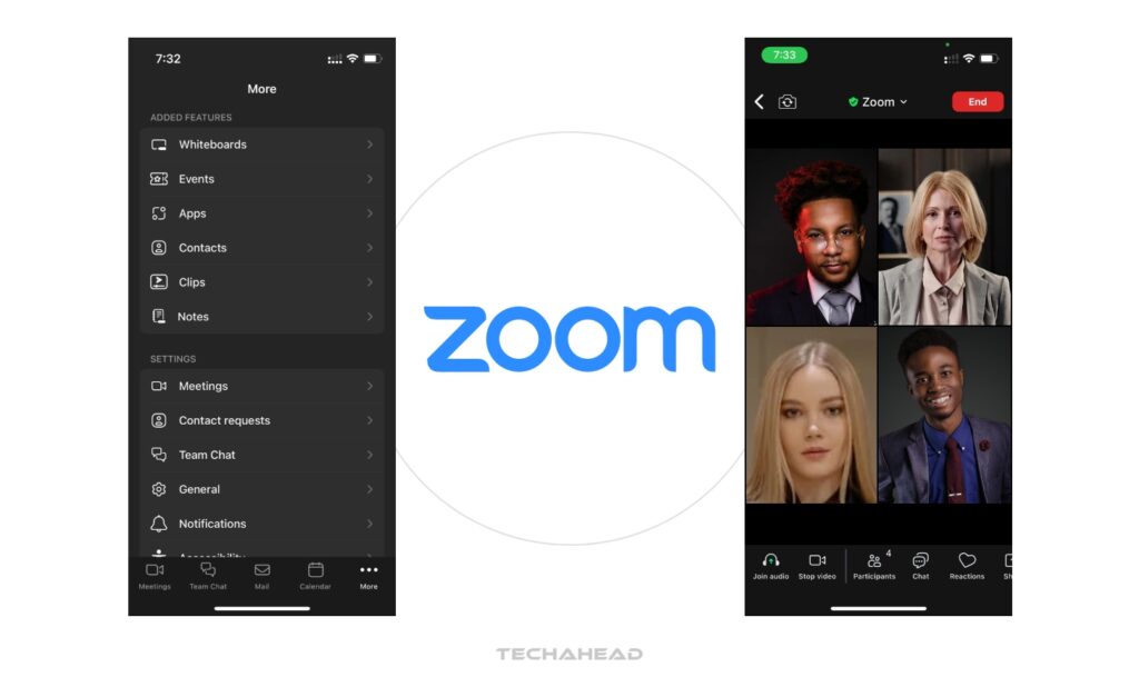
Zoom’s mobile user interface design is tailored to different industries, making it easy to find the right solutions.
Zoom’s idea of a mobile user interface design ensures users quickly find what they need, enhancing satisfaction and reducing bounce rates.
Read more: How to launch an app like Zoom meeting for your business

Tinder’s “swipe right” functionality is a simple yet powerful mobile app UI design for making connections. They have been taking dating people to a new horizon.
Tinder’s swipe mechanism is the highlight of the brand. People also use this as slang in their day to day life as well now.
Read more: Tinder System Architecture Design

PayPal’s app user interface is sleek, uncluttered, and impressive. They use vibrant colors to enhance the user experience.
PayPal’s mobile UX design principles are engaging and tailored to its key demographic. It makes it a standout financial app.

Robinhood is a well-known stock trading application. They have an easy and engaging clean mobile user interface design and user-friendly features.
Robinhood’s design ensures a wholesome experience with a focus on user needs and a clear information display.

Uber’s mobile user interface design is intuitive. It makes it easy to book a ride with just a few clicks.
Uber’s straightforward app user interface design has revolutionized how people can book a taxi. They offer a seamless user experience for their customers as well as drivers.

Creating a great mobile app requires tackling unique challenges and seizing opportunities that come with mobile design. As mobile technology continues to advance, it’s essential for UI designers to create exceptional and accessible mobile user experiences.
Here are five best practices to help UI designers at any level.
Many designers make the mistake of designing for desktop first and then adapting for mobile. Instead, begin with a mobile-first mindset. This means understanding and embracing the limitations of mobile devices, such as smaller screens, touch interactions, and varying network speeds.
By prioritizing the most essential elements and functionalities for mobile, you ensure they work well on smaller screens. This approach also helps you make smart decisions about what features to include, resulting in a streamlined and optimized design.
Good navigation is crucial for a successful mobile UI. With limited space, it is important to organize navigation options clearly and concisely.
Simple, well-structured navigation reduces the number of steps users need to take to find what they want. Avoid overwhelming users with too many choices or complex menus.
Instead, use straightforward menu structures, clear labels, familiar icons, and gestures like swiping and pinch to zoom.
Mobile devices come in various screen sizes and orientations. So, responsive mobile user interface design is the key.
Design your layouts that adjust seamlessly to different screen resolutions and aspect ratios. It ensures your app or website looks and functions well on any device.
Use grids to adjust contents with respect to the size and shape of the screen. Use fluid typography, which automatically adjusts font size and line length.
With limited screen space, it is essential to prioritize content effectively. Organize all the content in a logical way to help users find what they need quickly.
Use headings, menus, color, typography, and spacing to create a clear content hierarchy. Because if you are having a cross-platform app development it needs Progressive disclosure, which presents information in small, manageable chunks. It will help your users avoid feeling overwhelmed by too much text at once.
Optimizing your UI for touch interactions is required. Design large touch targets to accommodate different finger sizes and reduce accidental tape, minimizing user frustration.
Ensure there’s enough space between elements so users can tap accurately and comfortably. Add micro-interactions to provide feedback, letting users their tap has been registered.
Building a mobile app? There are a lot to consider.
First thing first, check out what other apps are doing. See what works well, what does not and get inspired by the designs which are available in the market. Then you can focus on making your app clear and visually appealing.
Keeping up with the latest trends can be tough, that’s where we come in. You will be needing a mobile app development company that specializes in UI/UX design. Which should be both beautiful and user-friendly.
Need a hand? TechAhead would love to chat and help you create a mobile app that users will love and that helps your business grow.
The most important mobile app design principles include simplicity, consistency, and user-centricity. Simplicity ensures that the app is easy to navigate and use, minimizing cognitive load for users.
Consistency in design elements like colors, fonts, and icons helps create a cohesive user experience, making the app intuitive and familiar. User-centricity focuses on understanding and addressing the needs and preferences of the target audience, ensuring the app delivers value and satisfaction.
Several mobile apps are recognized for their excellent design and user experience:
1. Spotify: Known for its dynamic content, personalized experience, and intuitive design.
2. Discord: Features a cohesive visual style, easy categorization, and live highlights.
3. Netflix: Excels in personalized recommendations, seamless navigation, and engaging visuals.
4. Zoom: Offers user-focused navigation, minimalist design, and consistent branding.
5. Tinder: Famous for its swipe-right functionality, simple interface, and emotional engagement.
Mobile app design principles differ from web design principles primarily due to the constraints and capabilities of mobile devices. The design must account for smaller screen sizes, touch interactions, and varying screen orientations, while web design often deals with larger screens and mouse-based navigation. Mobile user interface designs require simpler navigation structures and larger touch targets, whereas web designs can incorporate more complex layouts and interactions. Additionally, mobile apps often need to function offline and leverage device-specific features like GPS and camera, unlike most web designs.
The latest trends in mobile app UI design include:
1. Dark Mode: Offers a sleek look and reduces eye strain in low-light environments.
2. Neomorphism: Combines skeuomorphism and flat design, creating soft, extruded plastic-like elements.
3. Microinteractions: Small animations that provide feedback and enhance user interactions.
4. Voice User Interfaces (VUIs): Integrating voice commands and interactions for a hands-free experience.
5. Minimalism: Focus on simplicity and essential elements, reducing clutter and improving usability.
1. Cluttered Interfaces: Overloading the screen with too many elements can overwhelm users.
2. Inconsistent Design: Using different colors, fonts, and icons across the app creates confusion.
3. Poor Navigation: Complicated or hidden navigation options can frustrate users.
4. Small Touch Targets: Buttons and interactive elements that are too small can lead to accidental taps.
5. Ignoring User Feedback: Failing to incorporate user feedback can result in a subpar user experience.
Balancing aesthetics and functionality in mobile app design involves creating a visually appealing interface without compromising usability. Start by focusing on the core functionality and ensuring that the app performs its primary tasks effectively. Then, enhance the visual design to make the app attractive and engaging. Use color, typography, and imagery to create a pleasant aesthetic. But avoid adding elements that do not serve a functional purpose. Regularly test the app with users to ensure that the design remains both beautiful and practical.
We use cookies to ensure our website functions properly, improve performance, and provide a personalized experience. You can choose which types of cookies to allow below.
Required for core functionality such as security, network management, and accessibility. These cannot be disabled.
Help us understand site traffic and user interactions so we can improve performance and usability.
Enable enhanced functionality and personalization such as language or region preferences.
Used to deliver relevant ads, track campaign performance, and measure advertising effectiveness.