Mobile App on Boarding
There are various factors for user retention of your mobile app but keeping the famous saying in mind, ‘the first impression is the last’ a great user onboarding process is the key to success. In the current time where every entrepreneur aims to build an app to be used by millions of users, the main focus should be a well designed user friendly onboarding screen. There are plenty of app makers who often fail to build a UI/UX which deals with user friendliness and create an onboarding experience which confuses the user. And what next? The user will never return to your app.
According to Andrew Chen’s research an average app on Google play store losses 77% of its users within 3 days of the install and within 30 days the percentage reaches to 90%. Here, the aim is not just to get users, but to convert those users into power users.
There is no such thing called a secret formula for user onboarding, it’s a process of experimenting through A/B testing, gathering feedback and most importantly understanding your user behaviour. How about learning from the best? Try signing up to famous apps, make notes of their onboarding screen, take first hand experience of your competitor’s app. Be a user yourself to build a powerful user boarding experience. Let’s have a look at few best practices you should be following:
Don’t flaunt features, flaunt benefits
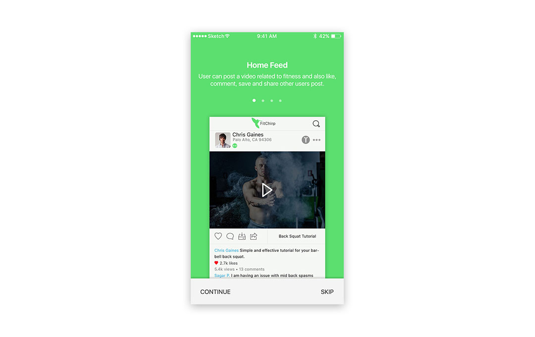
Emphasizing your value proposition is a prominent practice by highlighting only the key features and not the additional ones. Your app has some great features but wait a minute.. Who cares? Your users only care about what they can do with these features. Flaunt a feature in a way that it shows the user its benefits. Jason Fried from Basecamp says, “Here’s what our product can do and here’s what you can do with our product leaves completely different effect on the user’s mind. Don’t overload them with information.” A user only want to know the advantage of using your app so keep it simple and excite him with the first screen with minimum content and some stunning visuals.
(Keeping it simple, the first screen explains what a user can do with the app. By Fitchirp)
Don’t go for a tricky sign up
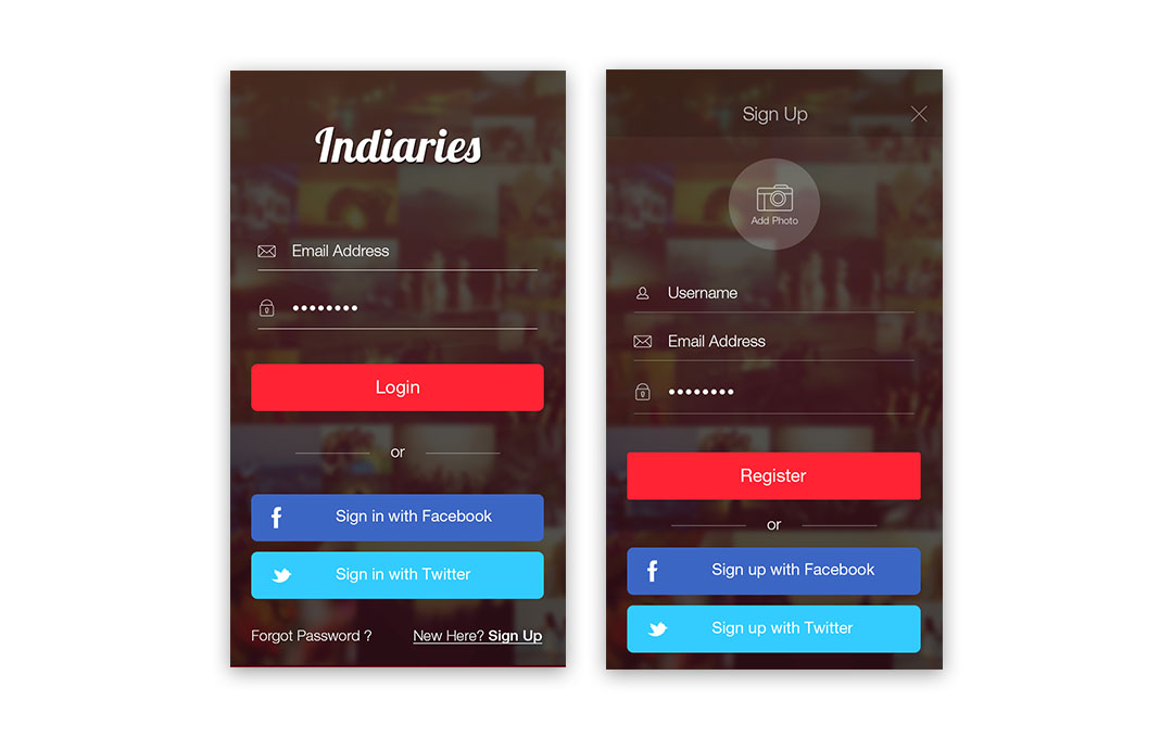
Most mobile applications losses a user in the very first step of a tricky sign up. Ask for the information required and not additional questions just for the sake of asking something. Give users the option to sign in through the existing social media channels or through email. It eases the login process and builds trust in the mind of a user. Never stop experimenting. Experiment whether facebook login works better than twitter or twitter works better than facebook or gmail works better than both? Experiment with the timings and placement. Few apps use the right hook placing the sign up screen at the beginning and few app makers place it at the end after building the trust with their users. Both works but you need to figure out what works for you.
(Multiple sign in options making the user comfortable. By Indiaries)
Use Progress indicators, don’t test their patience
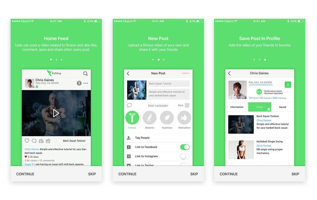
Forcing the users to swipe through multiple screens might irritate them, show them progress indicators. Progress indicators are usually placed as small circles providing user an idea of how many more screens they have to swipe through. It gives them the idea on the remaining steps letting them hold the interest of the tour. Also, don’t go on explaining everything about your app. Take one screen to explain one feature with visuals and not entirely text because you cannot expect a user to read a manual before using an app.
(Progress indicators. By Fitchirp)
Avoid the obvious and let them explore
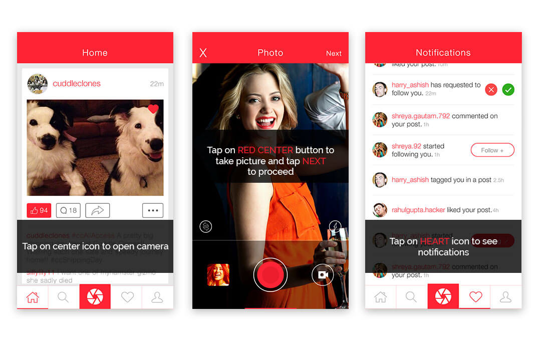
Make your onboarding process efficient by avoiding the obvious and keeping it quick. Your user is smart enough to figure out the meaning associated with the given icons. Explaining each and every icon is just a waste of time and high chance to lose a user. Few app ideas might force you to follow ‘app’s navigation structure’ approach but in many cases to build an interactive experience, ‘learn by doing’ approach is a must. Letting the users explore an app themselves builds a high level of interest pushing that urge to seek deeper engagement.
(The user is busy to complete the tasks given. How interactive! By Indiaries)
Taking up all the above measures will help you to build a strong and impactful user onboarding experience. There might be a lot of things you wanted to speak out but couldn’t due to text limitations. ‘In app notifications’ and ‘In app popups’ are more such ways to convey your message but that too has to be a benefit of the user, not flaunting a feature.
Never stop experimenting because evolution is an ongoing process.
There are multiple onboarding styles and different app idea fits into different style. ‘Which screen should be placed where?’ Such questions need to be answered by A/B testing. Focus on two key points:
A user should be able to figure out how to use the app in less than a minute.
The last step of your onboarding process should leave the user on the most engaging screen of your app. Eg: updating a status, clicking picture, finding a restaurant and so on.
Analyze your app. You should keep a track of where the user is coming from? For how long did he use the app? Which screen did he drop out at?
The answers to all the above questions will simplify your understanding on what your users want to see and frequent analysis and experiments will help you to build a great user on boarding experience.

