


 Copy Link
 Share on X
 Share on Facebook
 Share on LinkedIn


Always Active
Required for core functionality such as security, network management, and accessibility. These cannot be disabled.
Build intelligent AI systems that automate decisions, accelerate innovation, and scale business growth.
Design, build, modernize, and scale digital products that drive business growth.
Build secure, scalable, and intelligent platforms that power modern enterprises.
Build intelligent, connected, and autonomous systems that operate in the real world.
Flexible engineering capacity with predictable delivery, ownership, and outcomes.
Uncover the transformative potential of digital and mobile solutions for your industry

 Last Updated: May 11, 2026
Aug 11, 2017
Last Updated: May 11, 2026
Aug 11, 2017  5562
5562  11 min. Read


Stéphanie Walter is a Luxembourg based UX designer, currently working at the University of Luxembourg as the Visual, UI, UX designer. With over seven years of experience, Stephanie has worked with Université de Strasbourg and web and mobile agencies
Her expertise in UX design was further showcased in her insightful interview with TechAhead, where she discussed innovative approaches to user interface development and the evolving landscape of digital experiences.

Stéphanie Walter
Tell us about your journey as a UX designer.
Stéphanie: “I started working in the industry as an intern in Germany, where I was supposed to build a website for energetic solutions. That took me three months instead of six, so they gave me some other tasks to do, which included designing an iOS app. And this is how I discovered mobile and product design. I was very excited about improving the product for the users but did not know how. So, I started looking for articles online on usability and discovered the field of User Experience Design.
After two and a half years, I came back to France to work for a web agency. Agencies are often hired in the middle of the project, where a lot of strategic and user-related decisions have already been made. Most of the time, I was asked to build wireframes and design mockups. I tried to do my best, but selling and enforcing a user-centered design process proved to be quite challenging for many projects in the agency. Fortunately for not all of them. I was able to apply a more user-centered process for more product-oriented projects (mobile apps, for instance) where we were involved from the start and could help the client make the right decisions. I kept on learning by reading a lot of articles and attending conferences. I also read a few books on UX methodology and also on psychology, design thinking, and emotional design and gained more practice on those projects.
I think that the important thing is to try and practice whenever you can. Even a small 10-minute chat with a user or a perfect guerilla user test will help you get some information about your users and help you progress as a UX designer.”
How is your work experience at the University of Luxembourg?
Stéphanie: “It’s fascinating. For instance, I work with my team on a project where we apply user experience methods to design collaborative learning spaces for students. It’s nice to see how you can use those methods in other fields than digital interface design. It’s also challenging to work in a team with researchers and not people in the web industry: priorities in a University are entirely different from when I used to work in a web agency, for instance.”
How important is the visual response by a mobile app?
Stéphanie: “I think the visual response is significant, especially on mobile apps. If you don’t provide visual feedback to users, they might wonder why the app is not responding and think it is broken. Visual responses help a user to understand that everything works fine. They can also help build beautiful transitions between pages (material design does a great job with that) and make the user’s wait time shorter. Finally, a visual response can be a nice way to add some delight in your apps, from subtle transitions to even bigger animations.”
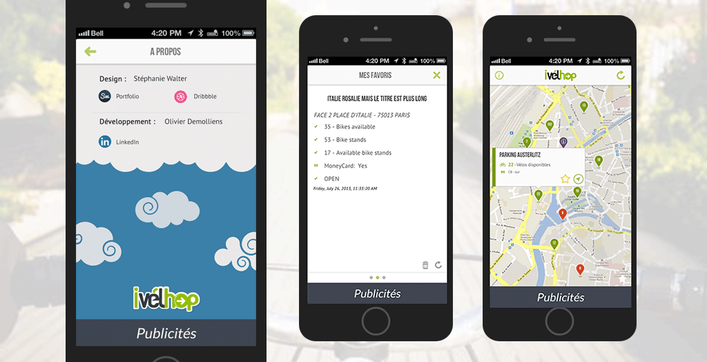
Project iVelhop Gif
Tell me about the most challenging project you have ever worked on. How did you approach the challenge?
Stéphanie: “The most challenging project was a website and an iPad app for music teachers. They would take a short recording of instrument practice sessions with their iPads and send these videos to the students through the platform to help them practice the same at home. The videos would be posted on a schedule so that the students would get them buffered throughout the whole week. We were only working on the website (the platform sending the videos), and another agency was working on the app. The budget was small, and so were the delays. I wasn’t involved from the start, and we were not able to do proper user research.
It began with the developer building an HTML CSS PHP prototype that would be used as the “base” for the discussion on functionalities. He sometimes came to me for some usability advice, but I was working on two other projects at the same time, so I was not much involved. I just had time to give some basic advice. After some weeks, the HTML prototype, built with no real specs and changed multiple times based on the client’s wishes and potential users’ feedback, made everything complicated. I tried to help them by building a clear, structured user flow with all the different types of user profiles possible. It helped a little bit. The project continued: after the prototype phase, they applied a UI template on top of the HTML (no budget for design, remember). Meanwhile, I met with the agency that developed the app. They would take care of the functionalities, and we would apply the same UI kit on top of the app.
A few months later, they sent us a demo of the app. Something was wrong. Users had to take the videos in a first tab, then go to a second tab to put those videos into a bundle, then go to a third tab, find the bundle, and schedule the ‘video sending’ for the week. The app was not usable; this user flow made strictly no sense. When we asked the agency, they told us that the app was based on their iPad framework and could not change it (well, this could mean rebuilding the whole app, and the client did not have the time or budget for that). I nevertheless did some paper guerilla user testing to try to find some solutions to the main issues without rebuilding the whole thing. We proposed a few things to try to improve this a little bit, but we were not confident that users would be able to use it.
We exported the mockups, and the client presented them to some users to test the app. And what happened was what we feared: nobody was able to complete the task. We were able to negotiate one full day of the budget to re-think the whole user flow.
We threw away everything built for the app developers. We started with the teacher’s needs (and not with their framework possibilities this time) and were able to have a fully functional user flow involving fewer steps than the first one. We presented this to the client and the developers. Everybody around the table agreed that it worked better. We decided to build a prototype and put it through a user test the week after. We started discussing user recruitment. It was a win for me. The developers left the room. Then, the client got a phone call. It was the app developers who, remember, were totally on board with the new workflow 15 minutes before when they were in the room. They apparently explained to the client that it would take another two months if we changed the workflow because what we proposed was not compatible with their framework. Of course, they never told this when they were in the room. This felt like backstabbing. And this was it, the end. The client could not wait for another two months; he wanted to launch as soon as possible. Bye-bye user testing, bye-bye new user workflow, they decided to launch the app as it was.
As I said, this is still my biggest regret so far. I regret not being involved from the start because of budget limitations and other factors. I think I should have insisted more and fought my way around the table. But I was less experienced than I am today. I believe this is also how you learn that sometimes, deadlines and client’s priorities don’t always align with the work you wish you were able to do. And I also consider it my most challenging project.”
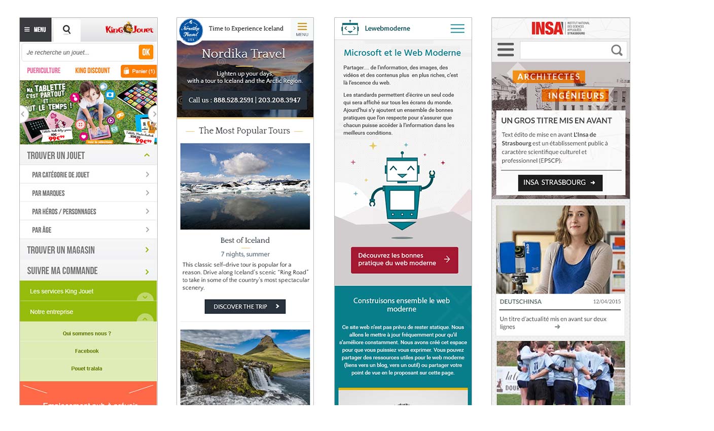
A few responsive designs by Stephanie
Where do you look for inspirational mobile design patterns?
Stéphanie: “Usually, I start by checking the OS guidelines. Both Android and iOS propose some excellent documentation. This helps me to make sure that I will not break any user habits. Then, I usually do a competitor benchmark, and it helps me understand what other people do and what I should not do. When seeking for specific inspiration regarding patterns, there are a few sites that can help :
Mobilemozaic
Pttrns
Of course, there’s also dribble, but it has become more of a showcase of what crazy things a designer can imagine than of inspiration for real projects, so I usually take a look but try not to focus too much on that.”
What is your approach to designing a perfect mobile app?
Stéphanie: “Firstly, I try to understand user needs: ask support for pain points, meet users and interview them, check analytics, a mix of quantitative and qualitative data is always good here to understand what they need and how can I successfully address those needs. Building personas and empathy maps based on those data will help the team gain empathy toward those users. I would then work on the user journey and user flow. How Will a person use my app? In which context? What kind of screens does she need? How are those screens linked to each other? Are there any issues things that can be improved? How to make her journey easier? Etc. Then comes the prototyping phase: I’m more comfortable sketching concepts on paper; it helps me explore more theories than opening a computer design tool. I try to build prototypes and test my hypothesis on real users before digging into the “ visual design phase.” There are a few tools like Invision or Marvel apps that will help you build click-through prototypes you can test online. Once everything works fine in the prototype, it’s time to choose colors, fonts, icons, and all the graphical details of the interface. I usually prepare mock-ups but also a detailed style guide to help developers’ work. This is also usually when I decide about animations and transitions between the different items and elements. Animation plays a significant role in user experience, especially on mobile. I try to test the prototypes or mockups whenever possible in the early stages of the process as well.”
Can you share some of your best Mobile designs?
Stéphanie: “Unfortunately, I worked a lot in the B2B industry on apps that are not in the official stores, so I can’t share the native app designs. But I did some nice things in responsive web design on Nordika Travel, for instance.”
What strategy do you use to make your mobile app onboarding process better?
Stéphanie: “I like the idea of progressive disclosure. I think it’s easier to teach users in context once they played a little bit with the app and are familiar with the concepts than to give them a big “here is a tour of what you can do and how you can do it.” Of course, this depends on the type of app you have. But in context, small help messages are always a good thing.”
What is the future of Mobile UI/UX?
Stéphanie: “It looks like we are trying to connect more and more devices and IoT to our mobile phones. So, I guess we will have to make sure the user experience will stay consistent on all of these devices, whether they are directly connected or in standalone mode. There is also a growing part of the world population using mobiles as their primary access to the internet. And those people might not have the last super powerful devices we designers and developers tend to have. So I’m delighted to see that the browsers are improving a lot and that a lot of functionalities like geolocation, offline support, notifications, etc., are starting to be available in browsers.
As a designer, which social channel is your favorite?
Stéphanie: “Twitter, even though 140 characters is sometimes complicated to deal with, it’s perfect for quick replies and finding useful links. Stack Exchange is also a good place to discuss usability and UI patterns with other people in the industry.”
Stephanie has a beautiful website with all her information, her recent talks, her blogs, etc. You can also follow her on Twitter and LinkedIn.
Don’t settle for an average app experience. Schedule a free consultation and Contact Us today to leverage the latest UX trends and best practices for optimal results.
We use cookies to ensure our website functions properly, improve performance, and provide a personalized experience. You can choose which types of cookies to allow below.
Required for core functionality such as security, network management, and accessibility. These cannot be disabled.
Help us understand site traffic and user interactions so we can improve performance and usability.
Enable enhanced functionality and personalization such as language or region preferences.
Used to deliver relevant ads, track campaign performance, and measure advertising effectiveness.