


 Copy Link
 Share on X
 Share on Facebook
 Share on LinkedIn


Always Active
Required for core functionality such as security, network management, and accessibility. These cannot be disabled.
Build intelligent AI systems that automate decisions, accelerate innovation, and scale business growth.
Design, build, modernize, and scale digital products that drive business growth.
Build secure, scalable, and intelligent platforms that power modern enterprises.
Build intelligent, connected, and autonomous systems that operate in the real world.
Flexible engineering capacity with predictable delivery, ownership, and outcomes.
Uncover the transformative potential of digital and mobile solutions for your industry

 Last Updated: May 11, 2026
Jul 21, 2017
Last Updated: May 11, 2026
Jul 21, 2017  4336
4336  7 min. Read


Continuing with Anke Mehlert’s interview, here is the rest of our conversation…
What is your approach to design a perfect mobile app?
Anke: “The first step is to understand the idea and the purpose of the product. That is often at odds with what the client considers these to be. Our job is to make users get ahead enjoyably, and that may be a tough sell. That’s why in this initial phase, designers have to collect any information from clients, product owners, stakeholders, and investors. It is good to do some data hoarding there as it also leaves a paper trail. If something shows up in the final product that is a discussion point, it is important to know where the request for it came from. While the happiness of the end user is paramount, you also need to understand that the idea of the product needs to add value to the target group that will have to maintain the product. A perfectly designed product can still be a massive failure if there is nobody to maintain it in a sensible manner or if it doesn’t have the full support of the people you build it for. Clients are also users.
Once you are happy with the information you have, you can start to draw rough sketches. Pen and paper are my tools of choice here. Paper prototyping is a simple, yet highly engaging and cheap way to iterate over ideas. This step allows the other stakeholders to see what you consider the main purpose of the product. It also allows for aligning those ideas, and you have to be quick in changing your approach. Whatever can be agreed on here can mean a lot of prevention of unnecessary work.
Once you reached a final understanding, you have to make everyone commit to it. This is again a good paper-trail safeguard before moving on to a low-fi first wireframe. Make sure to keep this as drafty and raw as possible. It is your discussion baseline with stakeholders, clients, product managers and your team. For you, this is the first iteration for improvement.
The ideal project will feature a proper testing environment to get input from end users as early as possible. This will give you insight into the “happy paths” of your product; the cow paths most tread by your end users. Getting this information is a great way to evaluate your earlier assumptions.
Next, we’d start on a low-fi click-dummy that not only verifies the information you want to get and show but also gives you insight into the user flow and if your approach is working.
Once this one is approved and tested, you can start with the proper UI work and have a stab at a first visual design that can be discussed with all the people involved. The trick is to keep things at a functional level at first and delay the inevitable discussions about what colors, fonts, and sizes. These don’t help when you want to find out what to build in the first place.
Ideally, this will lead you to the last 10-20% of your work where you are in the pixel-perfect, eye-candy lead phase of your work. This, of course, will mean that you should prepare for these suggestions to not get into the final product as the world isn’t pixel perfect. Your design will have to deal with compliance issues, device problems and will have to get past the interpretation of the dedicated app developers who will work with your design and style guide. However, a good developer can give you great insights into what makes sense and what doesn’t, so this is not a battle, but a symbiosis.”
Can you share some of your best Mobile designs?
Anke: “Not to the public. In a private or business surrounding, I am always happy to hold a presentation on my best work samples. But you can surely view my website.”
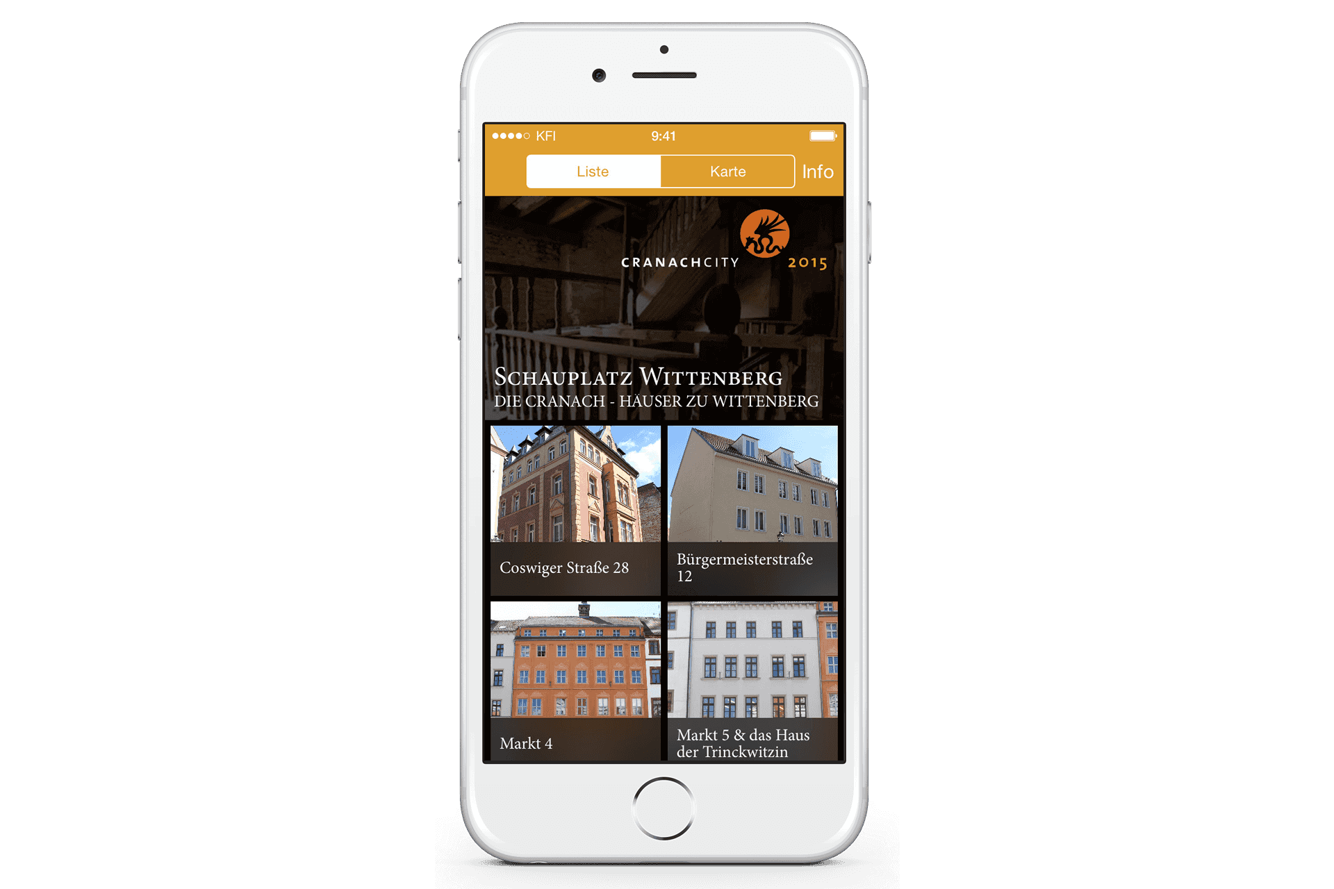
Mobile App Design for Schauplatz Wittenberg
What strategy do you use to make your mobile app onboarding process better?
Anke: “I try to avoid all onboarding processes that keeps the user from actually using the mobile application. When users start an app, they do not want to be presented with a 20-page long manual to swipe through. Also, if I have to educate the user on how to use the app before I allow him to enter, my app might be not intuitive enough.
The goal of onboarding should always be to increase the user friendliness, not to cover a lack of usability.
So the best mobile app onboarding process is to make it contextual. Therefore the strategy here is to think about the first-time experience of the user, test and observe first time uses and then give the user only one piece of information at a time and only when he is or might be stuck.”
What is the future of Mobile UI/UX?
Anke: “The main issue of mobile apps is the cost of acquisition. Once you have an app, people are pretty OK to use it, but it is far too hard to roll out new features. And new features are what people expect. Mobile interfaces have to change a lot more often than their desktop equivalents, and there is a cut-throat competition in being the first to market with a new feature. The current state of having to go through a marketplace and wait for two weeks for your changes to show up is very much ad odds with this need. This is why I am pretty sure that the biggest disruption we need is about distribution and acquisition of apps. Progressive Web Apps are a great step in that direction. Right now, these are a technical solution: you can send someone a link, and they see the content of this link without a browser, full-screen. You can then load the rest of the app in the background, and when the user comes back to the same link, the app will load instantly and be available offline for you. The missing part of this great idea is the UI/UX flow and that it currently doesn’t work in iOS. We always had “bookmark to home screen” in iOS, but too many users had disappointing experiences with the apps written with just that functionality. We have a great opportunity to avoid the annoyance of having to sign up to a store, have a credit card and download the whole app on every update. With Progressive Web Apps you try the app by visiting a link, and you promote it to something that works offline with an icon on your home screen when you think the experience was worth it. We now need to hammer out the flow of this promotion then we have the best of both worlds: the simplicity of web distribution and the convenience of offline functionality and push notifications and updates of apps. We can do atomic updates, not a whole app container at a time. And we can update information while the users do something, which comes back to the active waiting part.”
As a designer which social channel is your favorite?
Anke: “I use Twitter a lot. I like it that you can find a great variety of topics, from the recent world news to latest technological developments or just some funny dog pictures (yes, dogs. I’m not into cats.)”
Anke is active on Twitter and linkedIn. To know more about her work you can visit her website.
Stay updated with TechAhead to read about more such UX experiences.
We use cookies to ensure our website functions properly, improve performance, and provide a personalized experience. You can choose which types of cookies to allow below.
Required for core functionality such as security, network management, and accessibility. These cannot be disabled.
Help us understand site traffic and user interactions so we can improve performance and usability.
Enable enhanced functionality and personalization such as language or region preferences.
Used to deliver relevant ads, track campaign performance, and measure advertising effectiveness.